R Millard AS media production 2015
Friday, 24 April 2015
Development of our OTS
These videos start from some of our first cuts and develop into our last. It shows the development of our editing process.
1
hol&rub BC from Ruby Millard on Vimeo.
2
hol&rub BC 2 from Ruby Millard on Vimeo.
3
hol&rub BC 3 from Ruby Millard on Vimeo.
4
FINAL
Black Country Final from Ruby Millard on Vimeo.
1
hol&rub BC from Ruby Millard on Vimeo.
2
hol&rub BC 2 from Ruby Millard on Vimeo.
3
hol&rub BC 3 from Ruby Millard on Vimeo.
4
FINAL
Black Country Final from Ruby Millard on Vimeo.
Wednesday, 22 April 2015
Sound Track Records
I wanted to record the song that we were going to use on a record player to give it a crinkly crisp sound that vinyl has to fit with the style of the footage we have and the story line.
The first record that I got to test with the footage was unfortunately scratched so it jumped. We after tested the digital version with the footage and we found the pace wrong for the footage.
.JPG)
.JPG)
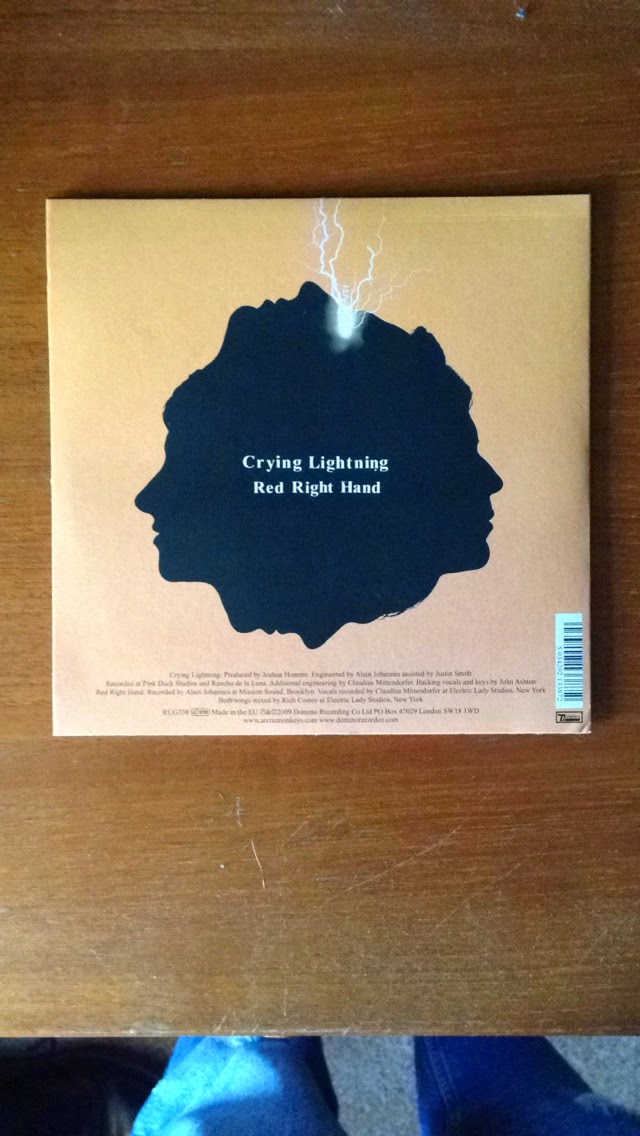
I then saw a band live and one of there songs had the right pace for our footage. I brought the record after the gig and recorded it into an MP3 on my record player. It had the right masculinity and high energy that we needed and I've chosen it for our OTS.
The first record that I got to test with the footage was unfortunately scratched so it jumped. We after tested the digital version with the footage and we found the pace wrong for the footage.
.JPG)
.JPG)
I then saw a band live and one of there songs had the right pace for our footage. I brought the record after the gig and recorded it into an MP3 on my record player. It had the right masculinity and high energy that we needed and I've chosen it for our OTS.
Soundtrack confermation - Drenge Dogmeat

After deciding that we wanted to use another song because it fitted the footage better we emailed the record company/band that owned it. We waited for a reply but did not receive one.
Sunday, 5 April 2015
Wednesday, 11 February 2015
Title Development 2
Whilst finishing the text I thought that it may look better scrunched rather than stained as it would look neater, cleaner and a lot easier to read. The audience may have been distracted by stains from the coffee or holes which I had burnt in the paper. The image still has a distressed look but I have made it look like this in a different way which is better suited to the OTS. It fits in with the smart crisp shirts that the actors are wearing. The text is off centre to give it a more candid casual feel. If it were to be completely in line it would not go with the nature of the story line. The footage that we have is dark and the bright contrast of the white paper was to distracting to use. It distracted my eyes after the dark scenes. I inverted it which I think works really well as the creases and dirty pen marks show through.
On our OTS I inserted a white flash transition between the last piece of fotage and the image of the title of the film we have created. The screen hots above show the change in light of the title and the last still of footage.
Props for OTS
Holli was incharge of reserching, finding and getting the props for our OTS. This is a basic image of the props that were used. Holli has a more information about them on her blog.
Link To Holli's Prop Post:
http://holliclarkasmediaproductionsschs2015.blogspot.co.uk/2015/02/props-used-in-ots.html
Friday, 6 February 2015
Title Development
These pages are from me developing a style of text. It will be used for the main title of the film. I may stain it with coffee or tea to make it look slightly aged. The textures will show through in the OTS even though it will be in black and white. This will look better than clean, plain cartridge paper.
Wednesday, 14 January 2015
Actors for OTS
The actors we have chosen are male and have the look of the era which we are setting out OTS in. We may need a third person to help us film the outside scene but so far we have worked well with two.
Friday, 19 December 2014
Sound analysis of 'Priest'
As I am looking at making most of the sound for our project I needed to look at the value of sound in film and different types of sound. I made notes on the film Priest as its sci-fi neo noir theme has an interesting mixture of techniques.
Basic Plot of extract: A family living in a dry plot in America are having dinner and suddenly they hear a rumble of animals running. The mother and father of the family put their daughter in a secret basement to protect her. They try to fight the creatures of with heavy steam punk guns but get slaughtered. The hatch opens and the daughter screams, we only see a shadow of a person who we presume to be a cowboy because of their hat.
Types of sound:
Dialogue (Words/Vocal) - This is anything vocal. Things said, sang ect.. In the extract of Priest that I watched the dialogue was very basic between the family. They say 'Bow your heads and say grace' before everything kicks off. This shows us how the use of speech can make us anticipate what is going to happen late in the clip. The tones of their voices are very low apart form the scene when the daughter screams as she is discovered by the anti-hero of the story. The high pitched tone is a huge contrast compared to the rest of the scene and makes us realise the severity of the situation. In our OTS I don't think we will use any dialogue but we may use vocals to create sound effects
Sound Effects/Foleying - Sounds that have been aded onto the top of videos to enhance sounds that should occur. They are most noticeable in high action films with explosions and gun shots. In Priest the house set is quite heavy. All of the furniture is dense dry wood and even the cutlery placed on the table is made from a heavy metal. This would not be as apparent if it was not enhanced or added during editing. The cutlery may have a natural diagetic sound when placed on the table but this can be amplified to conform to the style of the film.
Ambiance (Background sound, mood enhancing, wild tracks) - This can be almost anything it is general background noise. If a scene is set in a shop you would hear till noises and people gently speaking. If you were outside in a forest you may hear wildlife. I makes the audience more aware of the setting. In Priest there is constantly the sound of wind and dirt crumbling on the ground. This makes us aware that it is in the desert. This is non-diagetic as it did not occur when the footage was filmed.
Wednesday, 17 December 2014
OTS Logo design
This sheet shows my thought process as I came up with a name for our OTS. Its also a mind map for a logo/font that I will need to make.
Wednesday, 10 December 2014
Neo Noir
For example the film 'The Red Riding Trilogy' uses dark tones to express something quite depressing. This is typical of a film noir and it ties in with the story nicely.
I also looked at 'Blade Runner'. It feels like a modern version of a film noir as it has a blue filter most of the way through rather than being sepia which is a traditional colour used in film noir. This was the thing that stood out most to me as the classic look of smoke stood out off of a dark background.
The film 'Bound' reminds me of a classic film noir which has been transferred into modern day (1990's). It contains lots of art deco settings, a gangster boyfriend and a red black and white theme throughout. In this the Anti Hero is a woman rather than a man which is an unusual convention of film noir. Hence the title of neo noir.
Friday, 28 November 2014
Peaky Blinders History
PEAKY BLINDERS from ITV Central on Vimeo.
This is a news report on the history of the Peaky Blinders who were a gang in Birmingham close to the 1920's. The show has a Noir aspect to it so I will analyse its opening.
Wednesday, 19 November 2014
Continuity Task
What is continuity in a level media?
What was our brief?
We had to complete a task
which included making a video that helped us to understand continuity within A
level media. We had to stick to the following rules:
180 Degrees
The
most simple diagram which I found helped me to understand this most.
most simple diagram which I found helped me to understand this most.
Whist
filming you have to stay on one side of the action. It keeps the order of characters looking at each other when only
one character is seen onscreen at a time.
The
most simple diagram which I found helped me to understand this most.
Whist
filming you have to stay on one side of the action. It keeps the order of characters looking at each other when only
one character is seen onscreen at a time.
Match on action shot
Whilst
searching for what this exactly was I found a definition which summed it up
perfectly for me to be able to understand.
‘Match on action (or cutting on action)
is an editing technique for continuity
editing in which one shot cuts to another shot portraying theaction of the subject in the first shot.’
Shot reverse shot
‘Shot reverse shot (or shot/countershot) is a film technique
where one character is shown looking at another character (often off-screen),
and then the other character is shown looking back at the first character.’
In addition to this we had to include a door opening and
closing.
Holli & Ruby Final Continuity Task from Ruby Millard on Vimeo.
This is our final continuity video. My input on the task was filming and editing and my partner Holli was in the video and also contributed to editing
Se7en Analysis Essay
Se7en Analysis
The film se7en is about two
detectives on the hunt for a serial killer whose victims are attacked based on
the seven deadly sins. ‘Pride,
covetousness, lust, anger, gluttony, envy, and sloth.’ He makes a book for each.
During the opening title sequence we are shown the killers murder
diaries. As gloomy as it is they have allowed the creator of the scene to fill
the clip with different texture. The books have ratty pages and the ink seeps.
The director has also been quite clever to shine light through different pages
so that we are able to see what is on the other side. As they are full of dark
pictures of the victims and scribbled diagrams and mad thoughts. Defacing picture of a boy, starting with the eyes,
might indicate personal issues from childhood or simply represent the violence
of the character. While less graphic than say the images of instruments of
torture shown in the sequence, there’s something more sinister about the act of
crossing out the boy’s eyes. The act takes away something fundamental about our
sight that connects us, so the metaphorical removal of the eyes is like locking
the figure in, imprisoning. This may be the character showing is jealousy
without meaning to. He may not mean to show that he cares but in fact taking the
effort to target someone shows that he feels an emotion. Have it be anger or
hatred. We never see his face. This could be because we are meant to feel like
we are the character, or we are being shown by the character what great
accomplishments he has been making.
As a whole it gives us a schizophrenic experience from the murders mind.
There are electronic fragments of sound and extremely short close ups of the
Killers hands. Occasionally hand written text overlaps the filmed
footage. Broken and it looks as if it was not meant to be seen. Like the murder
could not help but blurt it out. It feels like it is on a different layer and
if it’s from the characters mind makes me think that he sees in more than one
dimension. Instead of hearing voices he may see them. Instead of seeing colors for example he may feel them. He may have Synaesthesia. Lots of
people would like to experience this as it is the unknown to the majority, but
this may eventually send someone insane and the confusion may lead them to do
strange.
After all of this I think that the character
is quite contradictive to himself. Two of the seven deadly sins are pride and
anger. To create something so detailed filled with things in different media
takes a long time. To not feel proud of what you have made at the end is
impossible. He feels anger towards the victims as they are committing the sins.
Which in fact means when he gets to anger he is committing it himself. I would
also include envy. He may feel this way towards the little boy who’s eyes he
crosses out. But I think at the end of the crimes he commits he feels to smug
to feel envious. Before he may have but in an act of anger it is taken away and
replaced with pride.
Thursday, 16 October 2014
Analysis of Se7en
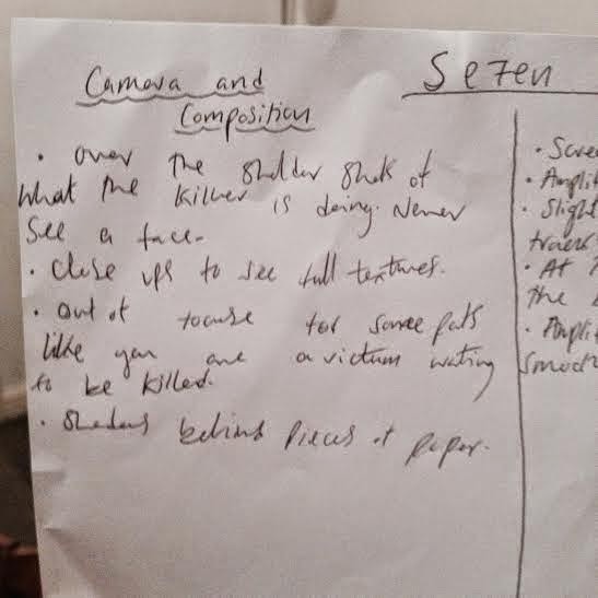
These are the notes which I made whilst watching the opening title sequence to the film Se7en. I find this method works best for me as when I come to write about it I will easily be able to look for the information that I need. I fill the boxes with ideas and suggestions as well as what happens in the clip.
This is the clip of Se7en:
What are the key conventions of an opening sequence to a film?
- Film Title – The can instantly
tell the audience what sort of film it may be. A children’s film about
dogs may have a food bowl incorporated into the text. Where as a horror
film may contain blood and axes.
- Credits – To identify
the key actors of the film and can be faded into the opening scene of a
film.
- Company logos – which
has worked on the films? Who has produced the film? Has anyone with a
distinctive style directed the film?
- Music/Sound – This can
incise an audience. An action film may have a gin shot for each mane shown
in a title sequence. It ties together the footage.
What makes a good presentation?
For this task I looked at a number of presentations which showed the key
things that opening sequences to films contain. I am the target audience so
they should be clear and structured as it’s the easiest way to learn things.
Each one seemed to hit this. Visually they were simple and the colors used weren't too bright or obscure to read off of. Most of them were dark which
looks good as it relates to the classic picture of a roll of film. Each slide
is titles and below states what it should. It is short and to the point which
is really important because if a presentation was being given an audience would
need to keep concentration thought.
Looked at:
Friday, 10 October 2014
Subscribe to:
Comments (Atom)


.jpg)


.jpeg)


.jpeg)
.jpeg)
.jpeg)


